Plot change in eEPSC amplitude with a connected line plot
Source:R/Plot-data.R
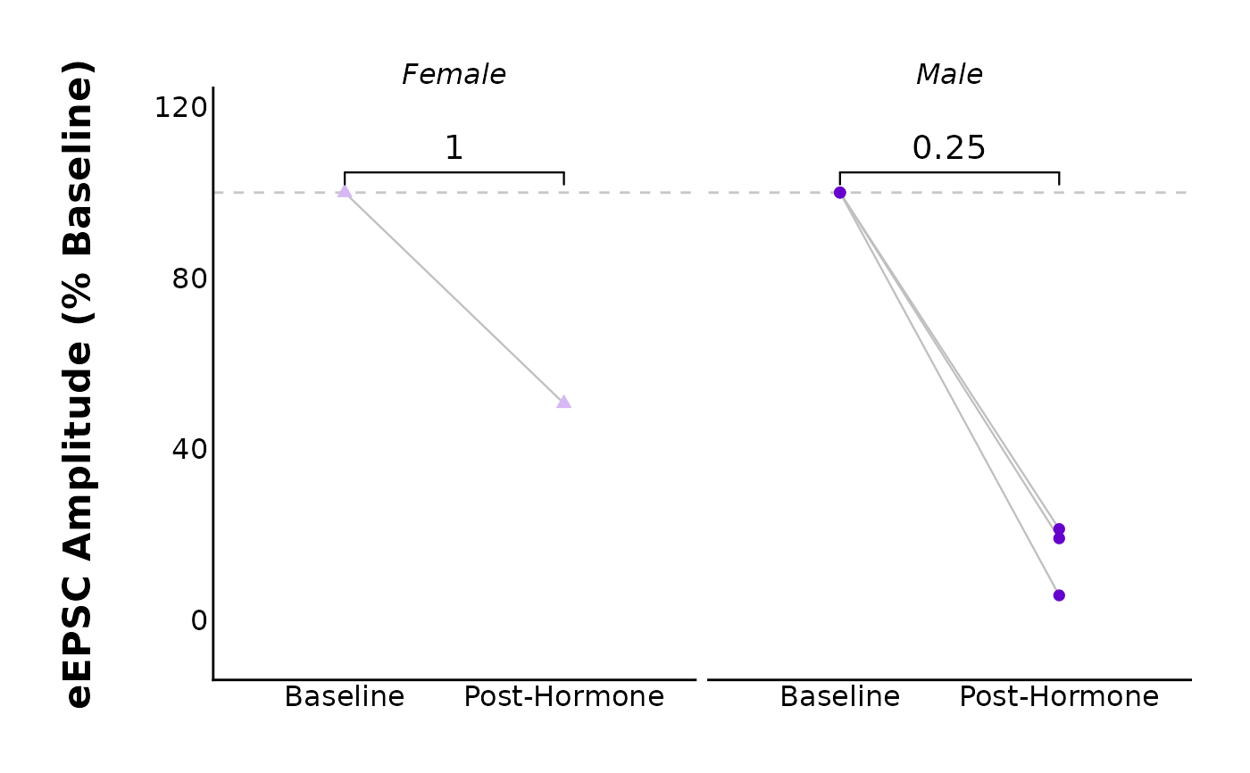
plot_change_as_connected_lines.Rdplot_change_as_connected_lines() creates a connected line plot to show change in eEPSC amplitude over time. Each line connects a cell's "before" point to the "after" value, with time (i.e. baseline and t20to25) on the x-axis and the
eEPSC amplitude on the y-axis.
Usage
plot_change_as_connected_lines(
  data,
  baseline_interval = "t0to5",
  post_hormone_interval = "t20to25",
  plot_treatment = "Control",
  plot_category = 2,
  included_sexes = "both",
  y_axis_title = "eEPSC Amplitude (% Baseline)",
  male_label = "Male",
  female_label = "Female",
  facet_by_sex = "yes",
  left_sex = "Female",
  geom_point_size = 2,
  test_type = "wilcox.test",
  map_signif_level_values = F,
  geom_signif_family = "",
  geom_signif_text_size = 5,
  geom_signif_size = 0.4,
  baseline_label = "Baseline",
  post_hormone_label = "Post-Hormone",
  treatment_colour_theme,
  large_axis_text = "no",
  save_plot_png = "no",
  filename_suffix = "",
  theme_options,
  y_variable_signif_brackets = NULL,
  ggplot_theme = patchclampplotteR_theme()
)
Arguments
- data
Summary data to be plotted. This will be the output of
make_summary_current_data()and will be third element of the list ($summary_data). It will likely be in the form ofsummary_eEPSC_df$summary_data.- baseline_interval
A character value indicating the name of the interval used as the baseline. Defaults to
"t0to5", but can be changed. Make sure that this matches the baseline interval that you have in the summary data. Defaults to "t0to5".- post_hormone_interval
A character value specifying the interval used for the data points after a hormone or protocol was applied. This must match the
post_hormone_intervalpresent in the summary data. Defaults to "t20to25".- plot_treatment
A character value specifying the treatment you would like to plot (e.g.
"Control").plot_treatmentrepresents antagonists that were present on the brain slice, or the animals were fasted, etc.- plot_category
A numeric value specifying the category, which can be used to differentiate different protocol types. In the sample dataset for this package,
plot_category == 2represents experiments where insulin was applied continuously after a 5-minute baseline period.- included_sexes
A character value (
"both","male"or"female"). Useful if you want to have a plot with data from one sex only. Defaults to"both". If you choose a single sex, the resulting plot will have"-males-only"or"-females-only"in the file name.- y_axis_title
A character value describing the y-axis title text. Defaults to
"PPR"but could be expanded (e.g."Paired pulse ratio").- male_label
A character value used to describe how males are encoded in the
sexcolumn of the dataframe used indata. This MUST match the value for male data in thesexcolumn, and it must be consistent across data sheets. Defaults to"Male".- female_label
A character value used to describe how females are encoded in the
sexcolumn of the dataframe used indata. This MUST match the value for female data in thesexcolumn, and it must be consistent across data sheets. This must be consistent in all data sheets. Defaults to"Female".- facet_by_sex
A character value (
"yes"or"no") describing if the plots should be faceted by sex. This is only available ifincluded_sexesis"both". The resulting plot will be split in two, with male data on the left and female data on the right.- left_sex
A character value ("Female" or "Male") describing the sex that will appear on the left side of a faceted plot. Only applies if
facet_by_sexis"yes".- geom_point_size
A numeric value describing the size of the points on the plot. Defaults to
2.- test_type
A character (must be
"wilcox.test","t.test"or"none") describing the statistical model used to create a significance bracket comparing the pre- and post-hormone groups.- map_signif_level_values
A
TRUE/FALSEvalue or a list of character values for mapping p-values. IfTRUE, p-values will be mapped with asterisks (e.g. \* for p < 0.05, for p < 0.01). IfFALSE, raw p-values will display. You can also insert a list of custom mappings or a function. For example, usemap_signif_level_values = function(p) if (p < 0.1) {round(p, 3)} else {"ns"}to only display the p-values when they are below 0.1.- geom_signif_family
A character value describing the font family used for the p-value annotations used by
ggsignif::geom_signif(). Defaults to""(empty value, will be replaced with default system font), but can be replaced with a named font. Use a package likeextrafontto load system fonts into R.- geom_signif_text_size
A numeric value describing the size of the text annotations (significance stars or p-values) on the plot. Defaults to
8.- geom_signif_size
A numeric value describing the size of the
geom_signifbracket size. Defaults to0.4, which is a good thickness for most applications.- baseline_label
A character value for the x-axis label applied to the pre-hormone state. Defaults to
"Baseline".- post_hormone_label
A character value for x-axis label applied to the post-hormone or post-protocol state. Defaults to
"Post-hormone"but you will likely change this to the hormone or protocol name.- treatment_colour_theme
A dataframe containing treatment names and their associated colours as hex values. See sample_treatment_names_and_colours for an example of what this dataframe should look like.
- large_axis_text
A character (
"yes"or"no"). If"yes", a ggplot theme layer will be applied which increases the size of the axis text.- save_plot_png
A character (
"yes"or"no"). If"yes", the plot will be saved as a .png using ggsave. The filepath depends on the current type, but they will all go in subfolders belowFigures/in your project directory.- filename_suffix
Optional character value to add a suffix to the filename of the .png file created with this plot. Could be useful if you want to specify anything about the data (for example, to distinguish between recordings produced in MiniAnalysis vs. Clampfit).
- theme_options
A dataframe containing theme options. See sample_theme_options for an example of what this dataframe should look like.
- y_variable_signif_brackets
A character value. You should only use this if your data did not pass assumptions and you had to transform it.
y_variable_signif_bracketsshould be the name of the column ofdatawhich has the transformed data (e.g. log-transformed data). Raw data will be plotted, but the significance brackets (and t-test/wilcox test) will use the transformed data. If you did not transform the data, leave this argument blank, and the function will automatically use the correct column associated withy_variable.- ggplot_theme
The name of a ggplot theme or your custom theme. This will be added as a layer to a ggplot object. The default is
patchclampplotteR_theme(), but other valid entries includetheme_bw(),theme_classic()or the name of a custom ggplot theme stored as an object.
Value
A ggplot object. If save_plot_png == "yes", it will also generate
a .png file in the folder Figures/Evoked-currents relative to the
project directory. The treatment will be included in the filename.
Details
If you specify a test_type, the function will perform a paired t-test or
paired wilcox test and add brackets with significance stars through
ggsignif::geom_signif().