How do I update the package?
To update the package, you just need to re-install the package using the same code you used to install it the first time:
pak::pak("christelinda-laureijs/patchclampplotteR")A message will appear asking you to type y (for “yes”)
for updating your existing package files. After this, your package
should be up to date!
Data FAQ
How do I quickly get cell counts per group?
The most efficient way to do this is to use the select()
function from dplyr.
sample_summary_eEPSC_df$mean_SE %>% select(category, treatment, sex, n)
#> # A tibble: 8 × 4
#> # Groups:   category, treatment [4]
#>   category treatment     sex        n
#>   <fct>    <fct>         <fct>  <int>
#> 1 2        Control       Female     1
#> 2 2        Control       Male       3
#> 3 2        HNMPA         Female     2
#> 4 2        HNMPA         Male       3
#> 5 2        PPP           Female     3
#> 6 2        PPP           Male       2
#> 7 2        PPP_and_HNMPA Female     1
#> 8 2        PPP_and_HNMPA Male       4
Plotting FAQ
This article contains answers to common questions about plots and
customizing the ggplot output of functions like
plot_raw_current_data().
Note: Above all, if you are confused about how a function works, be sure to check the Documentation for that function! If you type
?and the name of the function in the R console, it will bring up the help page for the function. For example, type?plot_AP_traceand then press the Enter key. The Help window on the bottom-right side of RStudio will automatically pop up with the documentation forplot_AP_trace().There are often extra arguments not included in the examples that you may find helpful if you need to re-adjust parameters like the image position in
plot_summary_current_data()or the bracket line width.
This is the plot we will use throughout the FAQ:
cars_plot <- ggplot(cars, aes(x = speed, y = dist)) +
  geom_point() +
  labs(x = "Speed (mph)", y = "Distance (ft)") +
  patchclampplotteR_theme()

cars_plot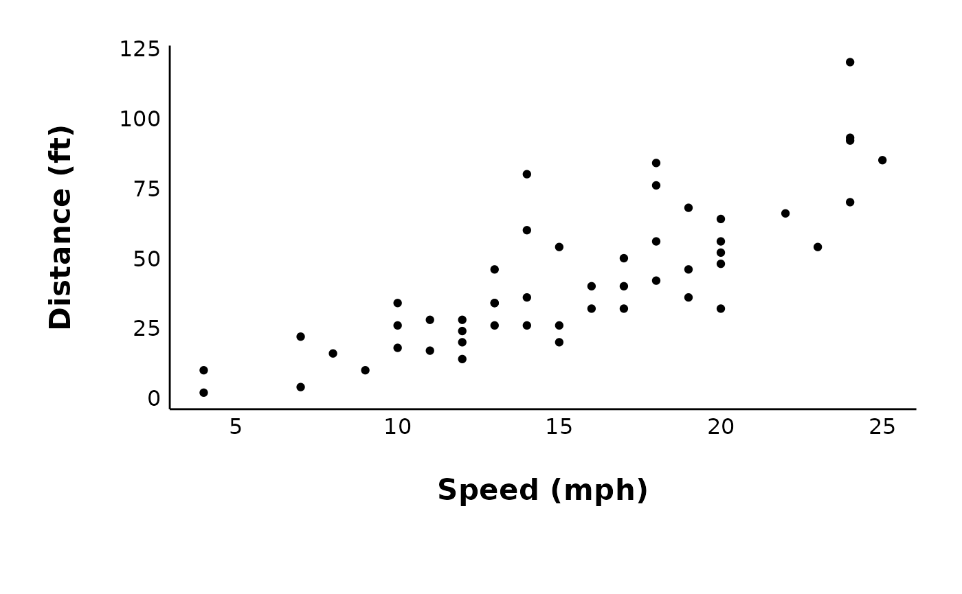
How do I save my plots outside of R?
Most plots have an argument called save_plot_png, which
you can set to “yes” or “no” (the default is “no” to cut down on run
time). If save_plot_png is set to “yes”, this will save the
plot as a .png using ggsave() and export it to
a folder. The subfolder will vary depending on the plot type. For
example, all plots generated using
plot_PPR_data_one_treatment() will be exported to
“Figures/Evoked-currents/PPR” relative to your project directory.
If you want further control over the export options, you can also use
ggsave() to manually save a ggplot object.
ggsave(
  cars_plot,
  path = here("Figures/Raw-plots"),
  file = "cars-plot.png",
  width = 7,
  height = 5,
  units = "in",
  dpi = 300
)
How do I remove built-in titles?
One quick way to do this (such as for a representative cell) is to
add a theme() layer and remove various components with
element_blank(). Here is an example of the default output
of plot_raw_current_data() with a built-in title and
subtitle:
raw_eEPSC_control_plots <- plot_raw_current_data(
  data = sample_raw_eEPSC_df,
  plot_treatment = "Control",
  plot_category = 2,
  current_type = "eEPSC",
  y_variable = "P1",
  pruned = "no",
  hormone_added = "Insulin",
  hormone_or_HFS_start_time = 5,
  theme_options = sample_theme_options,
  treatment_colour_theme = sample_treatment_names_and_colours
)

control_cell_plot <- raw_eEPSC_control_plots$L
control_cell_plot
To remove the title and subtitle, run this code:
control_cell_plot <- control_cell_plot +
  theme(plot.title = element_blank(), plot.subtitle = element_blank())

control_cell_plot
You can now save this plot with ggsave().
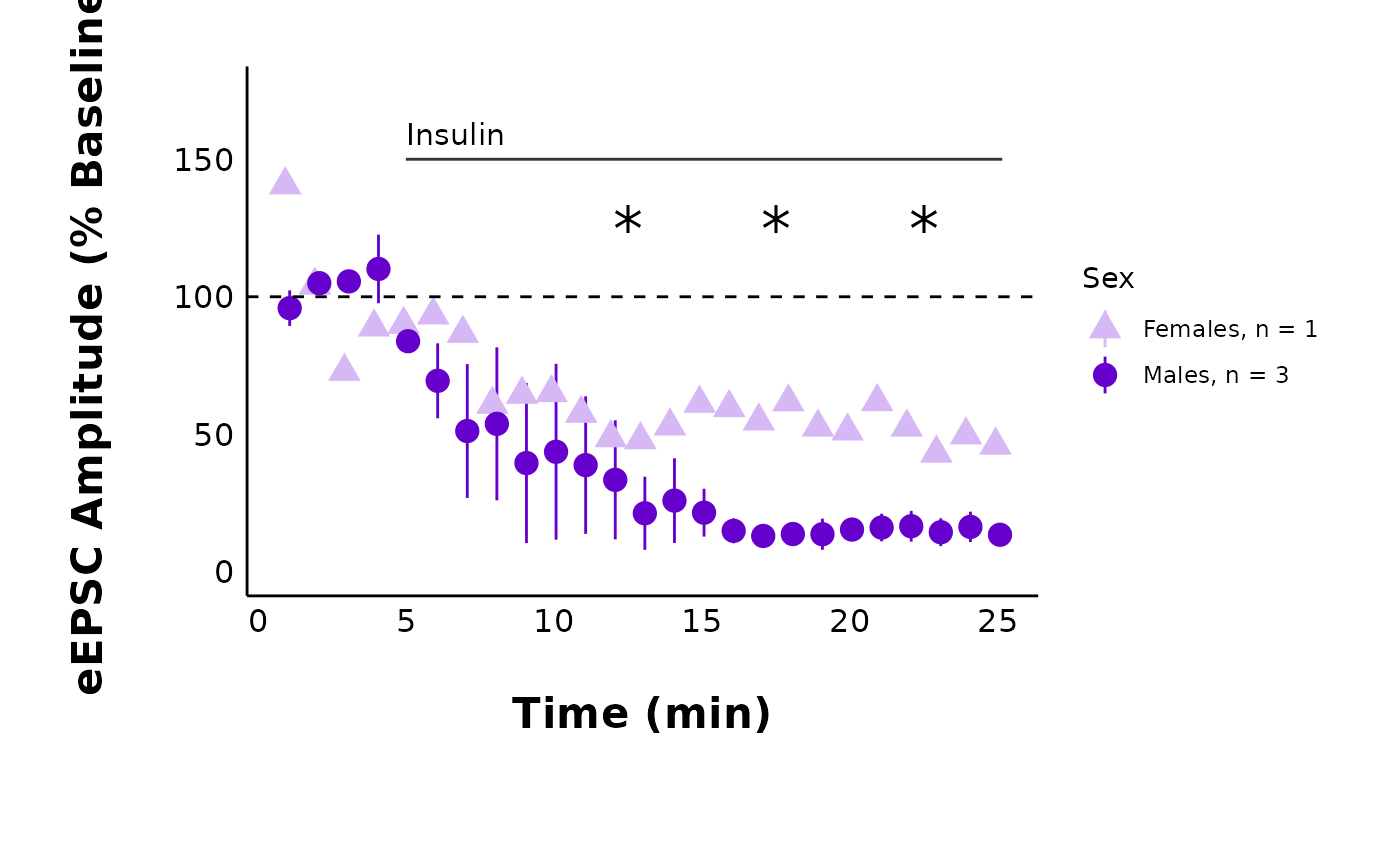
How do I add annotations (e.g. a line indicating hormones/antagonists?)
Let’s say you have a recording with HNMPA (an insulin receptor
antagonist) applied continuously throughout the recording. You can add
any number of annotations using + annotation(...). Two of
the most common annotations will be lines
(annotation(type = "segment")) and
text(annotation(type = "text")).
HNMPA_recording_FT
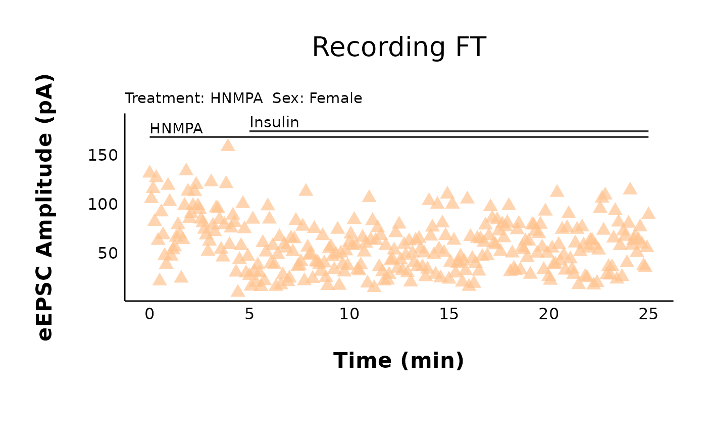
HNMPA_recording_FT + annotate(geom = "segment", x = 0, xend = 25, y = 168, yend = 168) + annotate(geom = "text", x = 0, y = 177, label = "HNMPA", hjust = 0)How do I change the plot text sizes?
A quick fix for making the text bigger is the
large_axis_text argument. Set large_axis_text
to “yes” to add a ggplot theme layer which increases and adjusts the
plot to be ideal for posters or presentations. If you want more control
over the font sizes, you can also apply a new theme() layer
and specify the text elements manually. For example:
cars_plot +
  theme(text = element_text(size = 25, color = "darkmagenta"))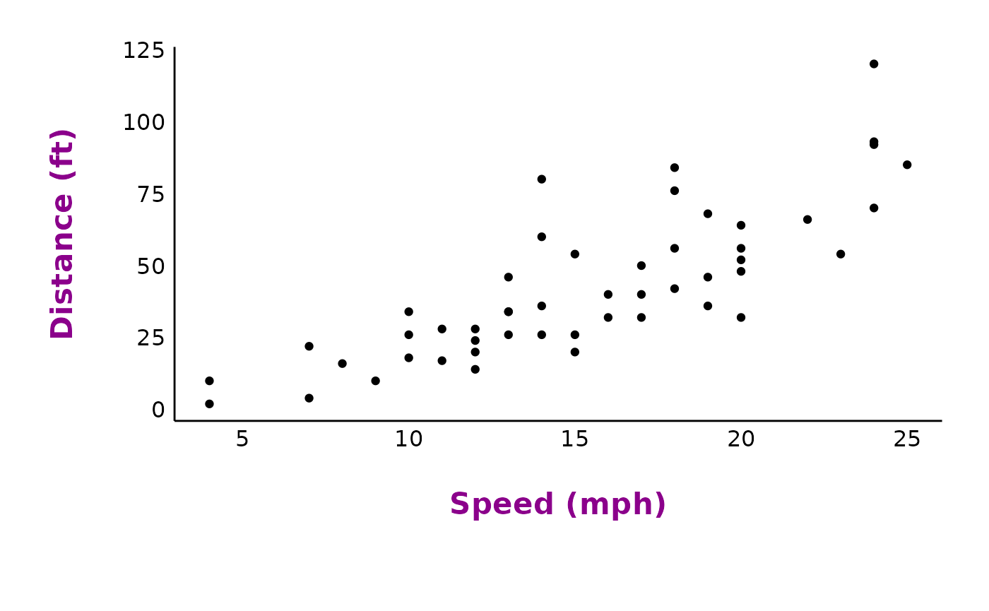
How do I change the plot font family?
This can be tricky and it will vary depending on your operating
system. I would use the extrafont package. You will need to
run the code below the first time you do this. Use fonts()
to see the list of fonts available to you in R.
Warning! font_import() will take a long time to run, especially if you have a lot of fonts on your computer. Luckily, you only need to do this once per system, or after you install a new font.
If the
extrafontpackage does not work, there are newer alternatives, such as theshowtextpackage, which makes it particularly easy to add Google fonts and system fonts.
If you already have the fonts installed in R, you just need to run
library(extrafont) at the start of your document to have
the fonts available to use.
cars_plot +
  theme(text = element_text(size = 25, color = "darkmagenta", family = "Calibri"))
To apply these theme changes globally (i.e. all plots in your file), it will be much more efficient to modify and define a theme. See below!
How do I modify the ggplot theme?
You might wonder things like, “How can I override the default theme
that came with this package?” or “How can I make all my plots have the
same theme/fonts, etc.?”. You can fix this efficiently by defining a
custom ggplot theme and adding this to the ggplot_theme
argument in all plotting functions.
Choose a theme like theme_classic() or the
patchclampplotteR_theme() that came with this package. Use
this theme as a base, and add new theme elements to replace just the
components you want to change (see the
documentation on theme modification in ggplot2. The new theme that
you define will inherit all components of the base theme, but replace
just the elements that you specified.
Important! You must assign this theme to a name, since the
ggplot_themeargument requires a named object. In this example, I will creatively call itmy_new_theme.
my_new_theme <- patchclampplotteR_theme() %+replace%
  theme(
    text = element_text(size = 25, color = "#333333"),
    axis.title = element_text(face = "plain", size = 14),
    panel.grid.major = element_line(color = "#ebebeb"),
    axis.text = element_text(face = "italic", size = 8, color = "#999999"),
    axis.line = element_blank()
  )
cars_plot + my_new_theme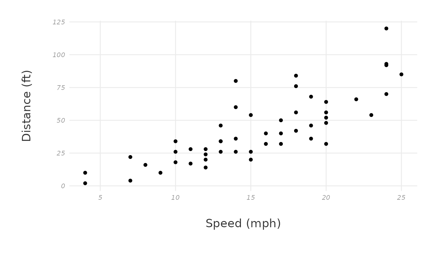
Now, insert this theme into the ggplot_theme argument.
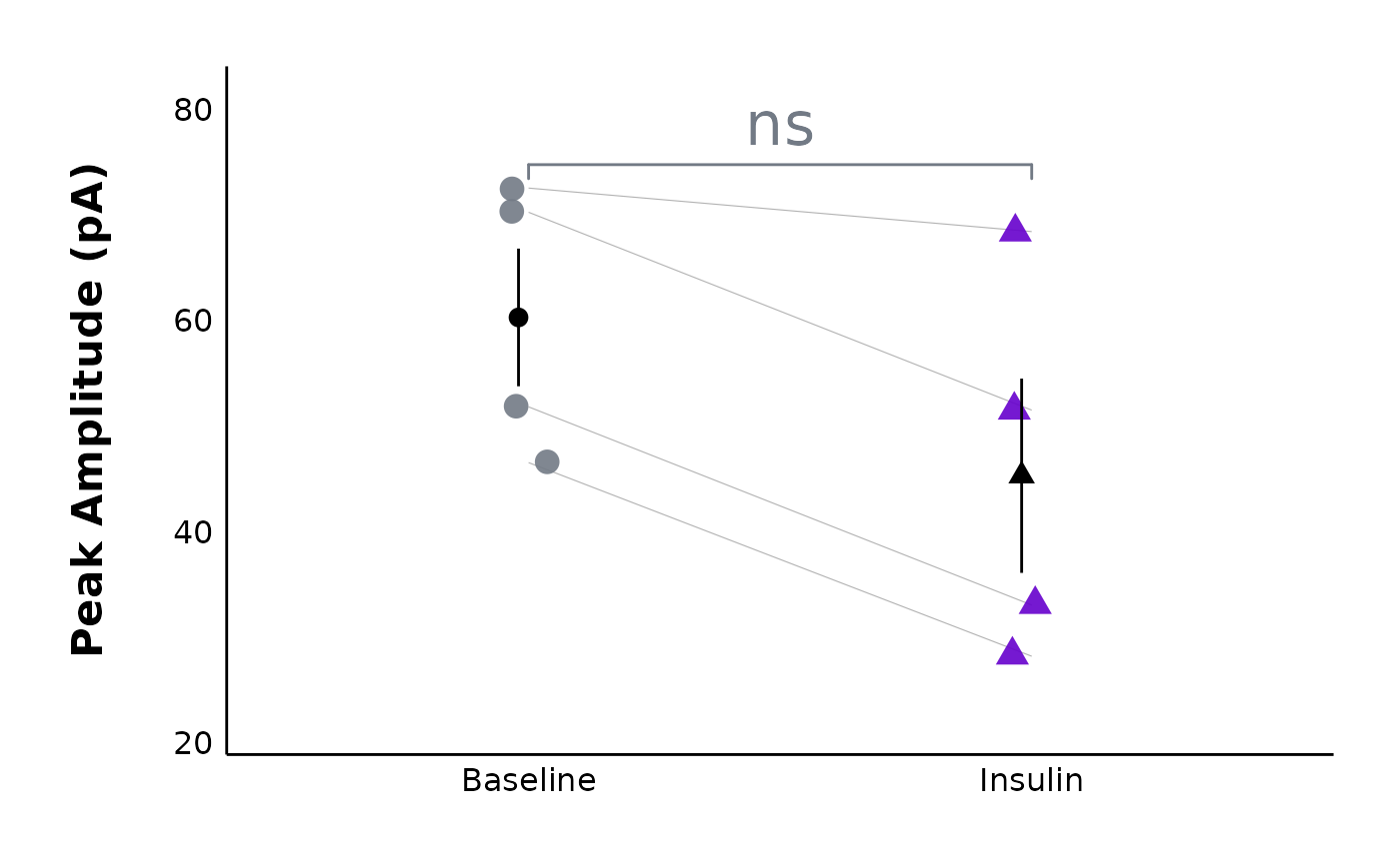
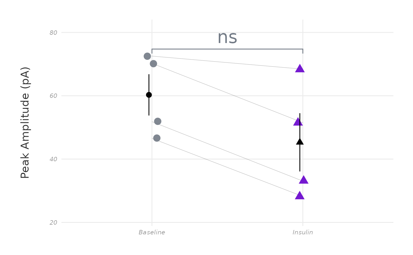
This is one of the sample action potential plots with the default theme
applied:
plot_AP_comparison(
  sample_AP_data,
  plot_treatment = "Control",
  plot_category = 2,
  y_variable = "peak_amplitude",
  y_axis_title = "Peak Amplitude (pA)",
  theme_options = sample_theme_options,
  baseline_label = "Baseline",
  test_type = "wilcox.test",
  post_hormone_label = "Insulin",
  treatment_colour_theme = sample_treatment_names_and_colours,
  save_plot_png = "no",
  ggplot_theme = patchclampplotteR_theme()
)
Here’s what the same plot looks like with the new theme:
plot_AP_comparison(
  sample_AP_data,
  plot_treatment = "Control",
  plot_category = 2,
  y_variable = "peak_amplitude",
  y_axis_title = "Peak Amplitude (pA)",
  theme_options = sample_theme_options,
  baseline_label = "Baseline",
  test_type = "wilcox.test",
  post_hormone_label = "Insulin",
  treatment_colour_theme = sample_treatment_names_and_colours,
  save_plot_png = "no",
  ggplot_theme = my_new_theme
)
How do I show one sex only?
You can use the included_sexes argument in
plot_summary_current_data(). It defaults to “both”, but if
you set it to “male” or “female”, the data will automatically be
filtered to show one sex only, and the resulting .png will
have “-males-only” or “-females-only” included in the filename.
How can I plot many treatments at once and/or plot even faster?
Let’s say that you are running a plotting function repeatedly, but
only changing one argument at once (like plot_treatment).
To reduce repetitive code, you can use pmap() from the
purrr package to run a function with a list of
treatments.
P.S. Do you want to plot many raw recordings at once? You may want to read the documentation for the function
make_facet_plot()!
First, I am adding a new column to
sample_treatment_names_and_colours which contains the
filepath to each representative trace .png file.
evoked_trace_filename <- c(
  "vignettes/articles/figures/Category-2-Control-Trace.png",
  "vignettes/articles/figures/Category-2-HNMPA-Trace.png",
  "vignettes/articles/figures/Category-2-PPP-Trace.png",
  "vignettes/articles/figures/Category-2-PPP-and-HNMPA-Trace.png"
)

list_of_treatments <- sample_treatment_names_and_colours

list_of_treatments$representative_trace_filepath <- evoked_trace_filename
Then, I’m using purrr::pmap() and inserting the
list_of_treatments that I defined above. This is so I can
use the treatment column in the plot_treatment
argument and the representative_trace_filepath column for
the representative_trace_filename argument. See below - the
summary plots for all treatments were produced with one code chunk!
pmap(
  .l = list_of_treatments,
  .f = ~ with(
    list(...),
    plot_summary_current_data(
      data = sample_pruned_eEPSC_df$all_cells,
      plot_category = 2,
      plot_treatment = treatment,
      current_type = "eEPSC",
      y_variable = "amplitude",
      hormone_added = "Insulin",
      hormone_or_HFS_start_time = 5,
      include_representative_trace = "yes",
      representative_trace_filename = representative_trace_filepath,
      y_axis_limit = 175,
      signif_stars = "yes",
      t_test_df = sample_eEPSC_t_test_df,
      large_axis_text = "no",
      shade_intervals = "no",
      treatment_colour_theme = sample_treatment_names_and_colours,
      theme_options = sample_theme_options
    )
  )
)
#> [[1]]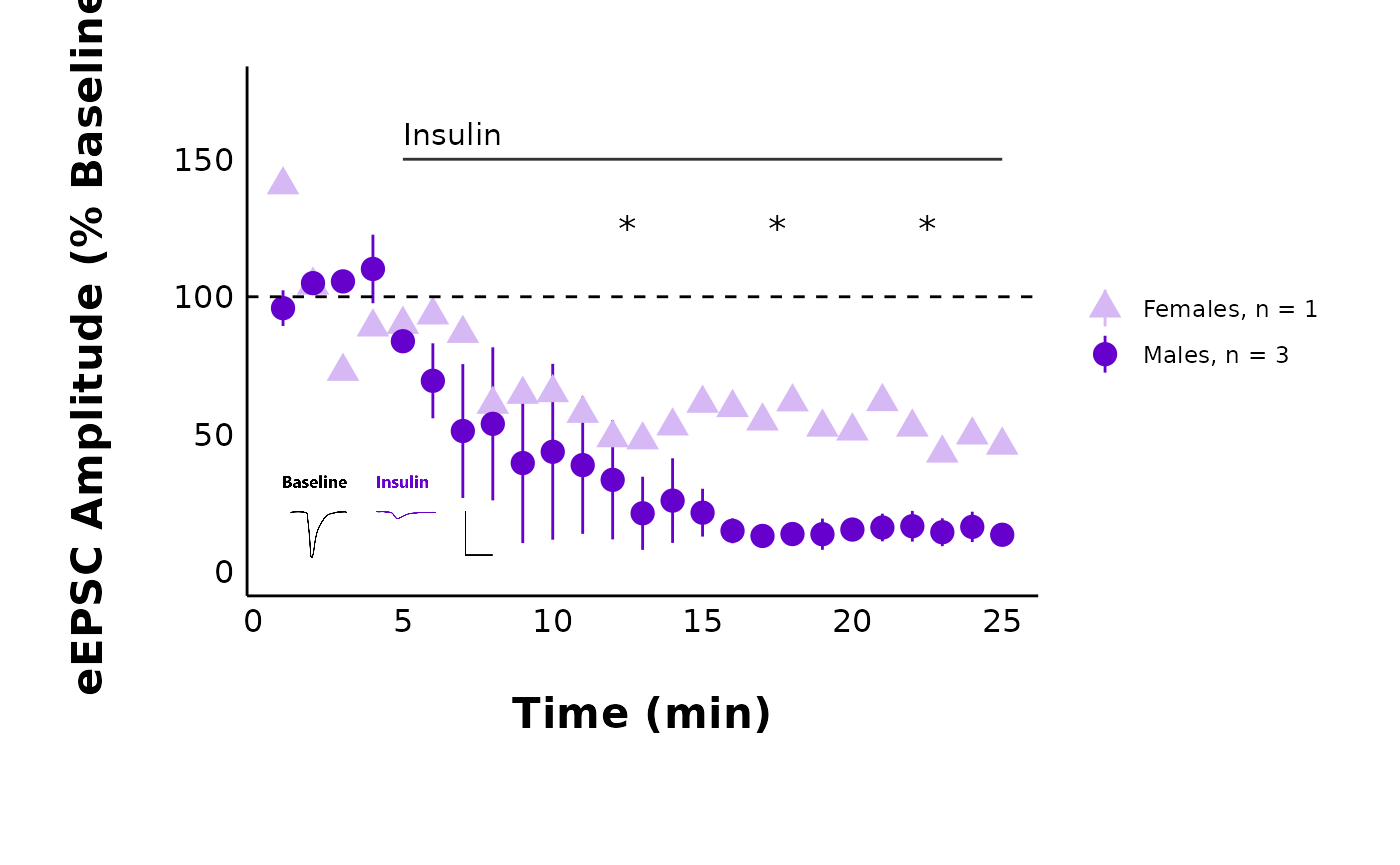
#>
#> [[2]]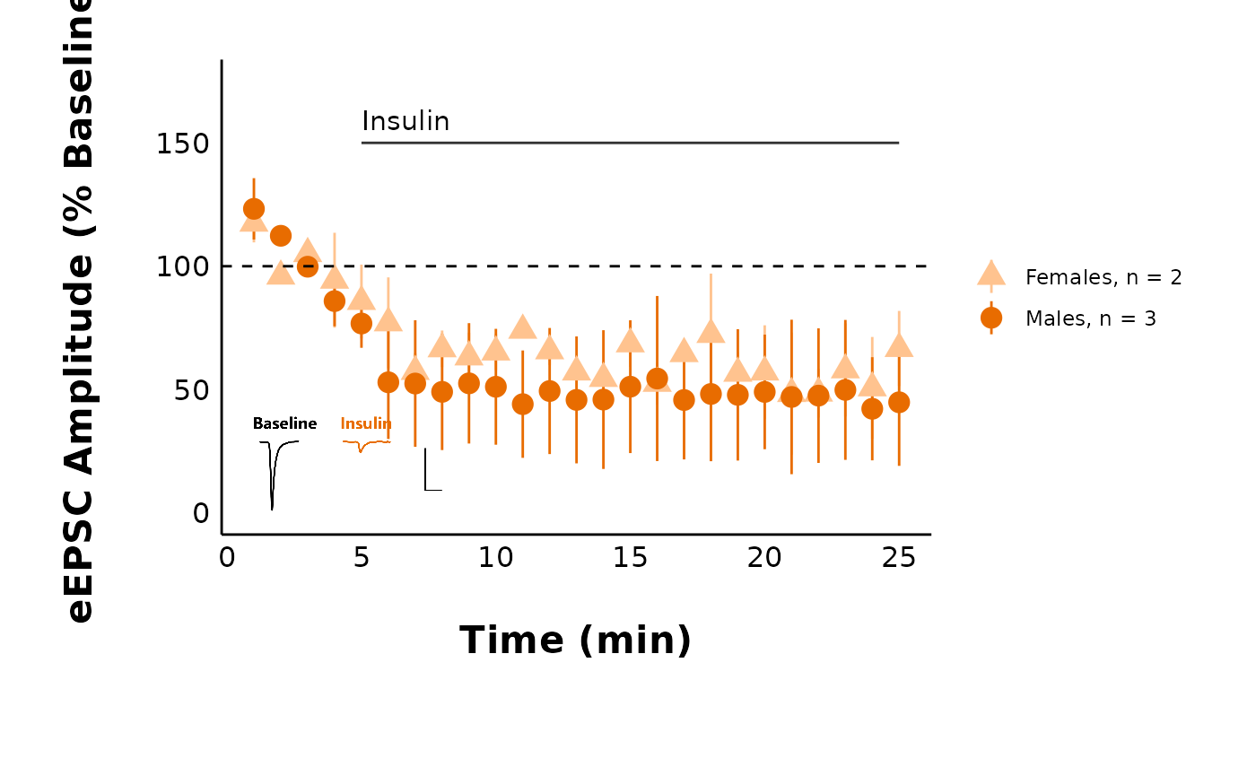
#>
#> [[3]]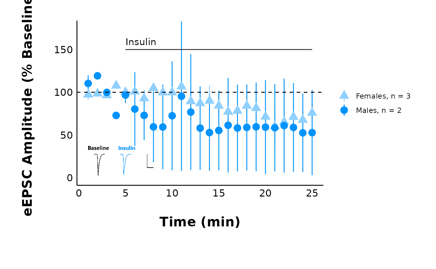
#>
#> [[4]]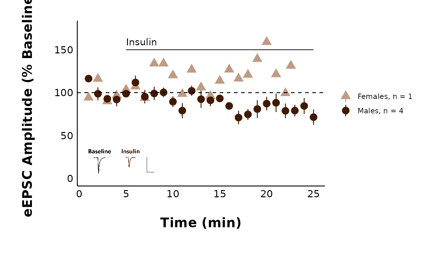
How do I only show some treatments?
Functions with multiple treatments (such as
plot_PPR_data_multiple_treatments() and
plot_AP_frequencies_multiple_treatments()) have an argument
called include_all_treatments. Change this to “no” and then
define a list of treatments in the list_of_treatments
argument.
plot_AP_frequencies_multiple_treatments(
  data = sample_AP_count_data,
  include_all_treatments = "no",
  list_of_treatments = c("PPP", "HNMPA"),
  plot_category = 2,
  treatment_colour_theme = sample_treatment_names_and_colours
)
#> `geom_smooth()` using method = 'loess' and formula = 'y ~ x'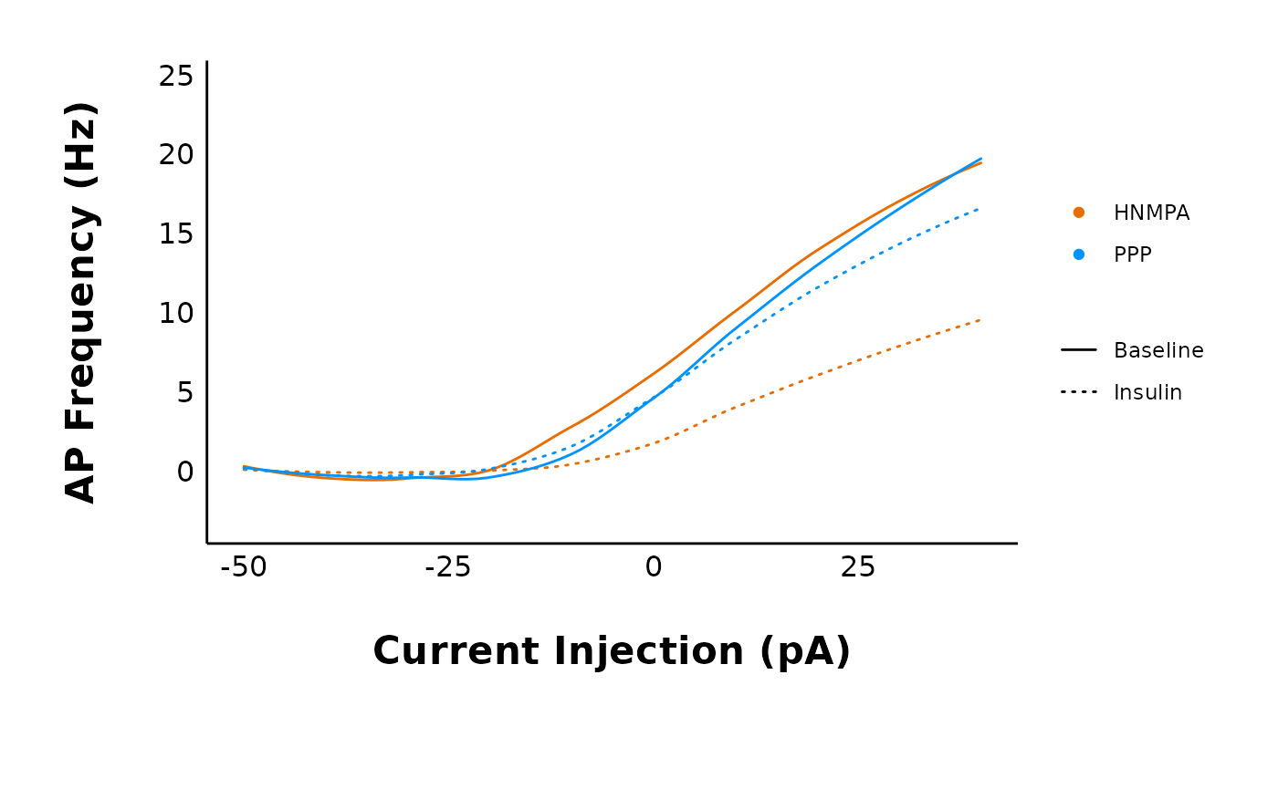
Theme FAQ
How do I insert my own colours and treatment names?
You will define your treatment names and colours once at the start,
then refer to it using the treatment_colour_theme in all
plotting functions.
This package comes pre-loaded with
sample_treatment_names_and_colours:
First, check out how many treatment groups you have using
unique(raw_eEPSC_df$treatment).
unique(sample_raw_eEPSC_df$treatment)
#> [1] Control       HNMPA         PPP           PPP_and_HNMPA
#> Levels: Control HNMPA PPP PPP_and_HNMPA
Next, modify this code to set up your own dataframe with your own hormone names and colours.
my_theme_colours <- data.frame(
  category = c(2, 2, 2, 2),
  treatment = c("Control", "HNMPA", "PPP", "PPP_and_HNMPA"),
  display_names = c("Control", "HNMPA", "PPP", "PPP\n&\nHNMPA"),
  colours = c("#f07e05", "#f50599", "#70008c", "#DCE319"),
  very_pale_colours = c("#fabb78", "#fa98d5", "#ce90de", "yellow")
)
Every time a plot contains the argument
treatment_colour_theme, refer to your custom dataframe.
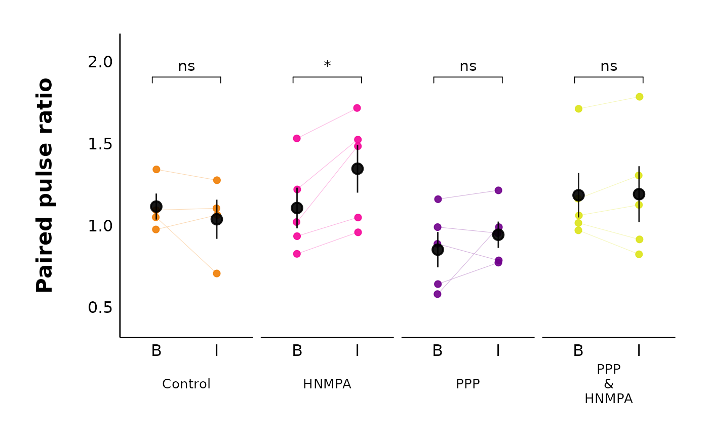
plot_PPR_data_multiple_treatments(
  data = sample_PPR_df,
  include_all_treatments = "yes",
  plot_category = 2,
  baseline_label = "B",
  post_hormone_label = "I",
  test_type = "t.test",
  theme_options = sample_theme_options,
  treatment_colour_theme = my_theme_colours
)
How do I modify the theme_options?
This dataset contains sample_theme_options that will
affect all plots. These include values for line thickness and the point
shapes for male vs. female data points:
To use the default values, just use sample_theme_options
in the theme_options argument of any plotting function in
patchclampplotteR.
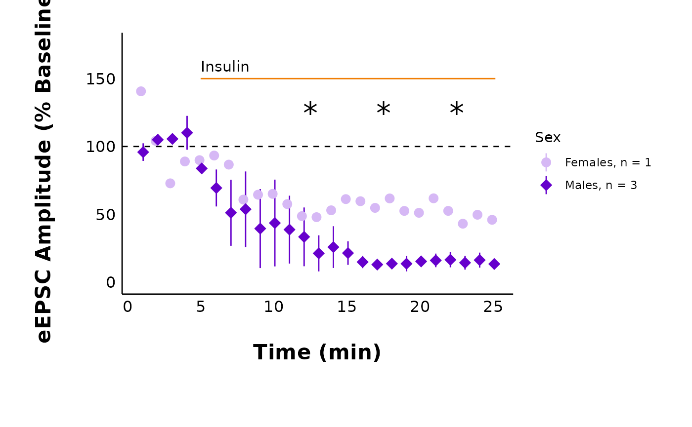
plot_summary_current_data(
  data = sample_pruned_eEPSC_df$all_cells,
  plot_category = 2,
  plot_treatment = "Control",
  current_type = "eEPSC",
  y_variable = "amplitude",
  hormone_added = "Insulin",
  hormone_or_HFS_start_time = 5,
  include_representative_trace = "no",
  y_axis_limit = 175,
  signif_stars = "yes",
  t_test_df = sample_eEPSC_t_test_df,
  large_axis_text = "no",
  shade_intervals = "no",
  treatment_colour_theme = sample_treatment_names_and_colours,
  theme_options = sample_theme_options
)
If you want to change these values, please follow these steps.
Step 1: Create a .csv file with two columns
(option and value), modelled after this sample
dataset.
Download my_custom_theme_options.csvImportant!: Your .csv must have identical columns and rows as the sample data, or else the plots won’t work!
Step 2: Read in the .csv file in using
utils::read_csv(). This will now be an object in your R
environment.
Step 3: Important!! You must convert the first
column (option) into the rownames. This is a
mandatory step to allow the theme_options to be indexed by row name in
plotting functions.
Step 4: Run the following code:
library(tibble)

my_custom_theme_options <- read.csv("my_custom_theme_options.csv") %>%
  remove_rownames() %>%
  column_to_rownames(var = "option")
Step 5: Check the resulting object. You should now have 11 objects of
1 variable, and the row names should be
gray_shading_colour, line_col, etc.
Step 6: Go to a plotting function like
plot_raw_current_data() and replace
sample_theme_options with your newly created object from
Step 5.
I changed line_col to orange, and I also changed
male_shape and female_shape. See, the graph
looks different now!
plot_summary_current_data(
  data = sample_pruned_eEPSC_df$all_cells,
  plot_category = 2,
  plot_treatment = "Control",
  current_type = "eEPSC",
  y_variable = "amplitude",
  hormone_added = "Insulin",
  hormone_or_HFS_start_time = 5,
  include_representative_trace = "no",
  y_axis_limit = 175,
  signif_stars = "yes",
  t_test_df = sample_eEPSC_t_test_df,
  large_axis_text = "no",
  shade_intervals = "no",
  treatment_colour_theme = sample_treatment_names_and_colours,
  theme_options = my_custom_theme_options
)
What does this package replace?
This package replaces manual plot creation and data analysis in GraphPad Prism and/or Excel. Previously, data analysis would have required transferring data between programs, which is time-consuming and potentially error-prone. This package can be combined with report writing in R to generate fully reproducible manuscripts.
Package FAQ
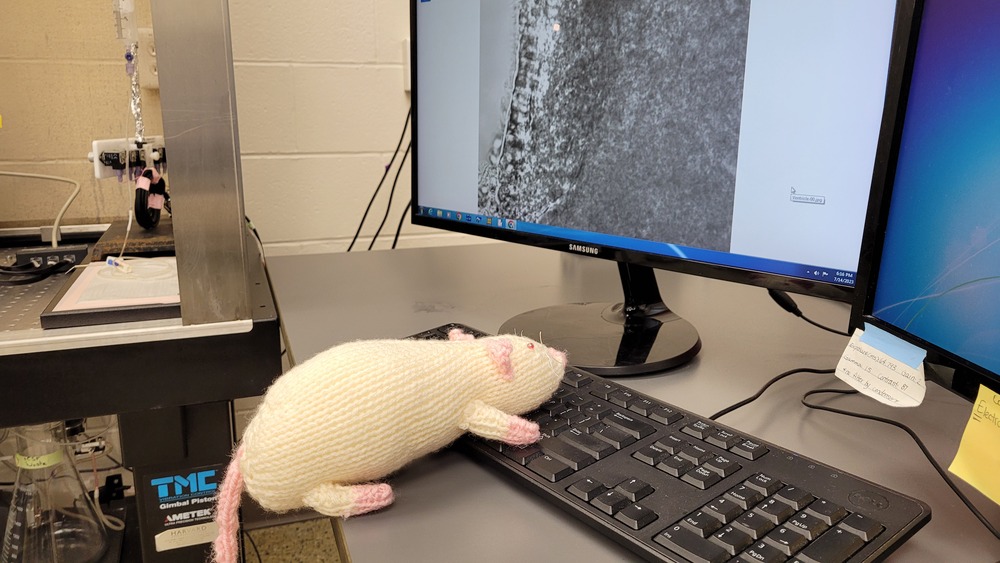
Who’s Ruby?
Ruby is a rat, and she’s also become an unofficial lab mascot for the Crosby lab! She loves helping out with data analysis, welcoming newcomers to the lab, keeping lab members company, and serving as an emotional support rat. She found a way to sneak into some of the documentation for this package!

Ruby says ‘Hi humans!!’
When the lab humans aren’t around, Ruby can often be found at the computer or snuggling up with her friends, Millie and Lily, in one of the many hiding places in the lab.